RecaptuR | Mobile App Design & Build
RecaptuR’s logo, invocative of a camera and using the imagery of double “r” to allude to app functionality with side-by-side photos.
project overview
the market problem:
Imagine trying to retake a photo of your house originally taken in 1910. Where did the original photographer stand? What was the height and angle of the camera?
Recapturing a photo exactly is a near impossible task without a tripod and trial and error. Users often can get close, but proportions may skew, the angle may be wrong, and the field of view may suffer from different aperatures and distances from the subject versus the original photo.
the solution:
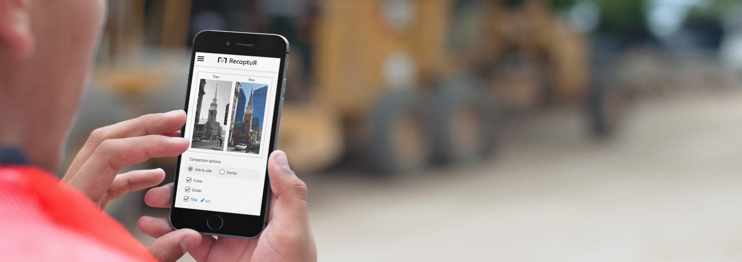
RecaptuR is a camera-overlay tool. The tool assists users in recreating the perspective and orientation of a previously-taken photo resulting in a perfectly recreated image capture. This can be applied to before-and-after DIY projects, then-and-now city shots, even recreating photographs taken 100 years ago! The possibilities are endless.
the methodology:
An initial image from the user’s gallery is aligned in the camera viewfinder. A transparent version of this image is overlaid on the viewfinder while the user takes (recaptures) a new photo, using key elements from the original to orient the device to exactly replicate the original.
the team:
Product Manager/Creative Lead - Nicolas Emerson (me)
UX Design - Lauren Schechinger
Software Engineer - Maya Nigrin
Most user stories follow the traditonal persona-requirement-purpose format, showing who-what-why to justify development.
telling the user stories
the purpose:
User stories define the individual features which define the functionality within an application.
For RecaptuR, I wrote out nearly 50 user stories to convey my requirements for the application to the team. This immediately brought uniform understanding and opened up dialogue within the team, making the resulting application even better!
the epics:
RecaptuR’s purpose fit into a handful of overall epics:
Home - A launching point for the user
Capture - Take a new photo with an overlay
Compare - Create a comparison of the old and new images
Settings - Defining Settings
A window into the user flow shows branching functionality and planned features.
user flow
small application, robust flow:
While the basis of RecaptuR is a camera app with a simple overlay, there is still a significant workflow to empower the user to be successful. That flow was iterated on based on a review of functionality impact and engineering feasibility.
Feeling out the user flow brought new ideas to the table for a streamlined user experience and allowed for consolidation of features which ultimately reduced the engineering lift during development. With a well thought out user flow, the application should feel intuitive on first use.
User flow built with Figjam.
wireframing & prototype
fully planned:
The user flow was recreated as wireframes to crystalize the user experience. All potential configuraitons of the user’s screen were built then, then linked together to model functionality in a prototype. This allowed for validation of design elements prior to release to development. The engineer provided feasibility feedback based on the provided design, further reducing development lift.
Wireframes and prototype built with Figma.
An example of React Native code, as used for RecaptuR.
development
Development on RecaptuR is currently underway. The app is being coded in React Native to facilitate ease of release across iOS and Android — design once, develop once! Upon development completion, the application will be user-tested, refined, and uploaded to the App Store and Google Play Store.
delivery target:
Currently, RecaptuR is targeted for a February 2025 release.


