BiV Lab | Logo Design
design objectives
the client spec:
Design a logo for a lab at Northwestern University which researches bio-inspired computer vision: BiV Lab. The logo should be both professional - able to represent the lab in international conferences - as well as engaging and dynamic - inspiring to young researchers looking for a lab and a university for their PhD. The logo should be the crossroads of fun and science.
the design:
The design of the BiV Lab logo incorporated both a creative storytelling arc as well as a typographic study. Questions asked during the design process include:
How do you tell the story of vision, the breadth of research of a lab, all the while inspiring “fun”?
Should the design lean heavier on computer or biological references?
What design elements will tie the separate pieces together?
How will a 2D design translate 3D concepts studied in the lab?
The BiV Lab Logo, vertical stacked form
creating the design
the inspiration:
The design for the BiV Lab logo quickly narrowed based on the focus of the research performed therein. The BiV Lab studies the refraction and interpretation of light through biologically intricate eyes spanning the animal kingdom. Eyes became a natural focus of the design.
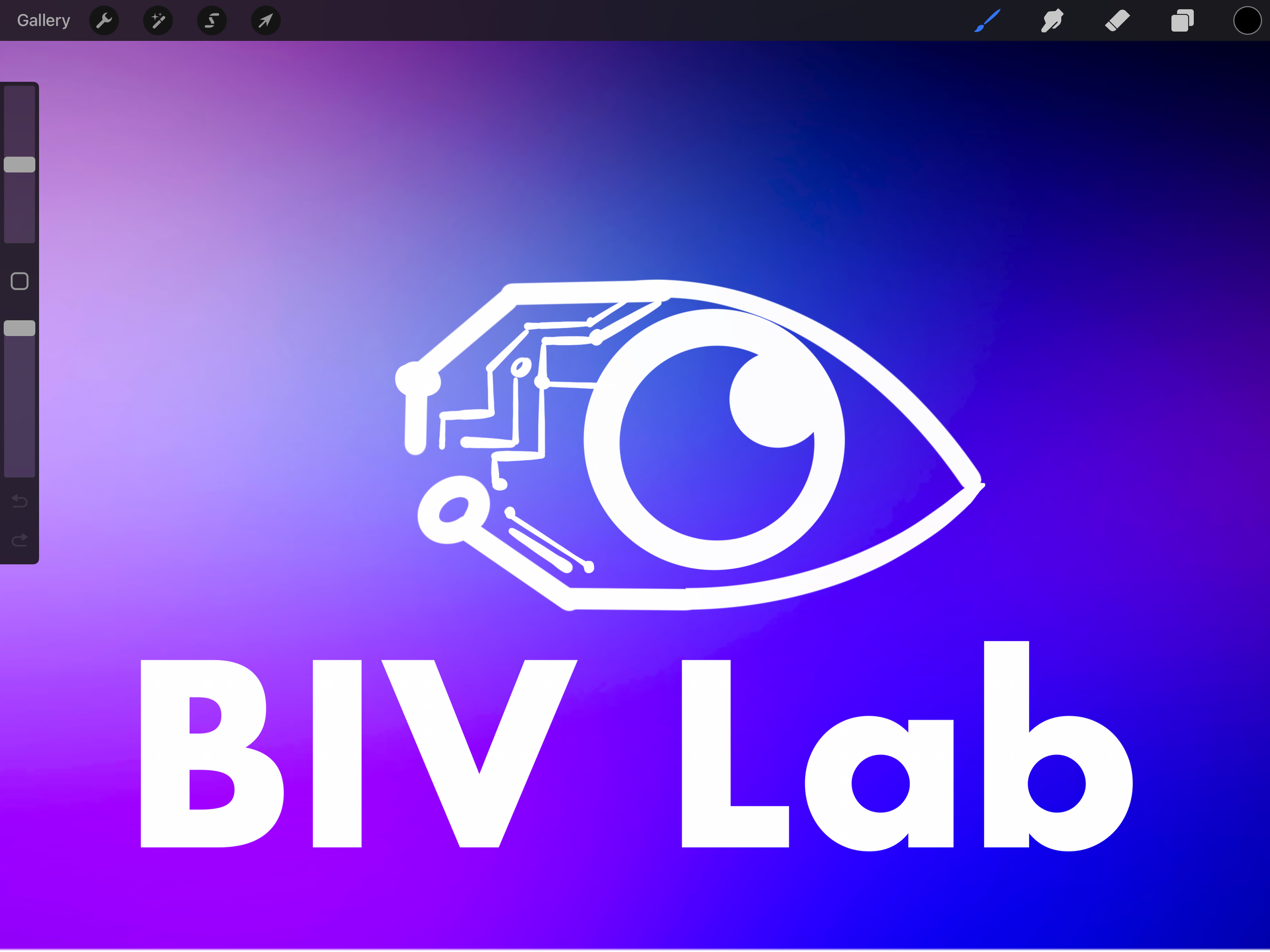
Unused designs for BiV Lab
the story told
The story of the BiV Lab logo is told through the design itself:
Style
A flat, material-style logo was settled on for the way the clean, crisp aesthetic allows for use of color, removes size restriction, and can easily overlay on different fields of color.
Pupils
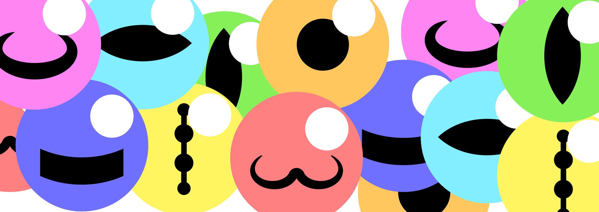
Human eyes with their round pupil are only one form of eye in the animal kingdom. Eyes take on many different pupil shapes.
Colors
When researching pupil shapes, it became clear that eyes come in every color of the rainbow. The eyes that form the “V” are every range from violet to red, capturing the entire ROYGBIV spectrum as a wink to the refraction of light and the natural V-shape this process takes.
Animal eyes, left to right: stingray, goat, horse, cat, gecko, owl, cuttlefish
the story continued
The story of the BiV Lab logo is told through the design itself:
Spiders
Spiders are an important part of the history of the lab’s research. They were the first eyes studied by the lab’s founder.
The dot over the i, with its smaller dot to the upper right, is a call out to the eye of a spider.
Spider eyes on the internet-famous anmiated spider above showcase the design approach in the letter i in “BiV”
Reusing the same diameter circles across the design builds cohesive feel to the custom typography
building the design
Typeface
The logo font is hand-made. The “V” made of eyes came first. In deciding lettering to accompany this shape, repeating the circles that made the eyes for the dot on the i and the loops of the B was a natural fit to tie the text together.
Vision
The dual loops of the B being matching circles call out the prominence of the traditional dual-eye structure found in the animal kingdom, while the rounded upper edges of the base of the i give reference to human shoulders, with the dot serving a second purpose, making for a head, the traditional home of the eyes.
Stack Divider
The divider for the horizontal and vertical stacks is not a standard line-divider. This line takes on the shape of the lense of an eye.
Real owl eyes set into the letter B in “BiV” show the connection to dual-eyed vision in nature
design is iterative
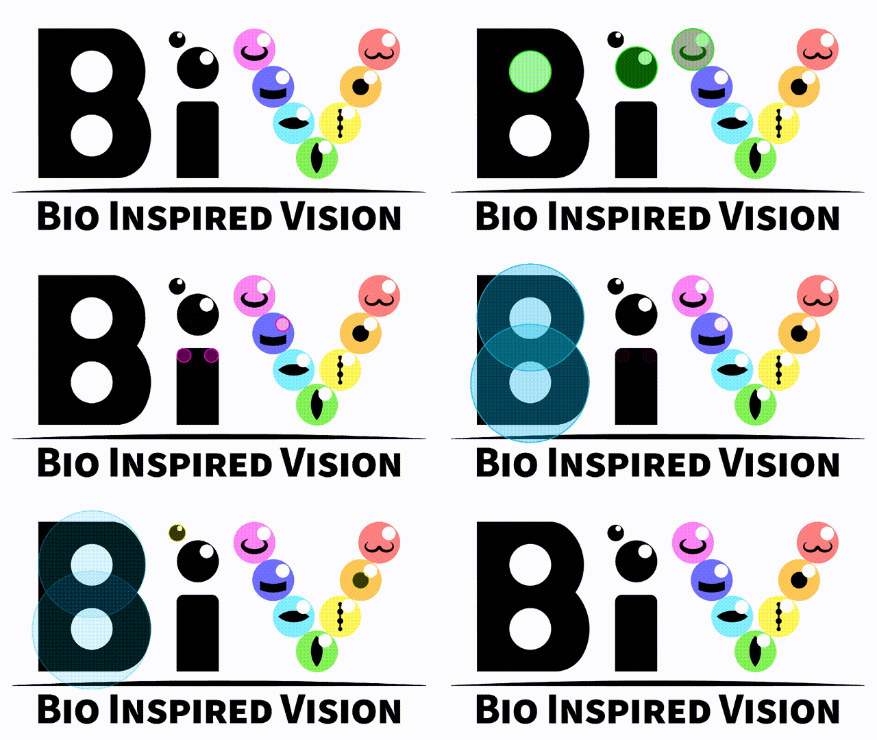
The journey from a vision to a design naturally takes curves and finds crossroads. My approach is very iterative, much like software development. Along the way, we’ll work through use cases for how the design will feature, I’ll present side-by-side comparisons for A/B testing with my clients, and I’ll further refine the design to make sure it is usable at every level.
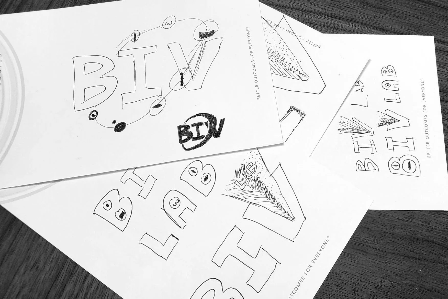
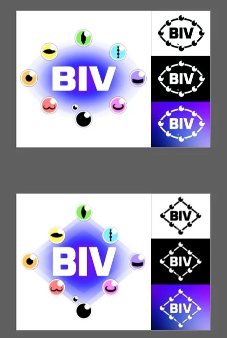
BiV Lab was no different in this regard. On the right are featured some designs which didn’t make it and some variations on typeface which were not part of the final design.
treating the design like a product
Showcasing BiV ready for multiple use cases across multiple color fields
-
Whether it soliciting client feedback or making an aesthetic design choice, developing visuals on design choices and presenting them side-by-side for an A/B choice. This means some designs will be left behind, but it ensures quality decisions and client buy-in along the way.
-
Often, the entire gamut of use cases for the design are not clear at the start of a project. It is important to identify these up front so a design can be optimized for all uses.
In this study, BiV Lab intended their design to be used at large scale — for conference banners and wall art — as well as at small scale — on business cards and document headers. The design needed to be prepped and ready for this scaling.
-
Most designs start in a monochromatic fashion — black and white. When colors and details are added to the design, it becomes imperative to consider how the design will play on various color fields.
BiV Lab identified that their logo should work on Northwestern University Purple, a dark field color. To make this work, all designs early on were considered with both black-on-white and white-on-black color schemas. To maintain the integrity of the design, details were removed from the eyes to continue to evoke the BiV Lab brand through the logo’s shape while reducing any mess which may come from overly complex patterns.


